

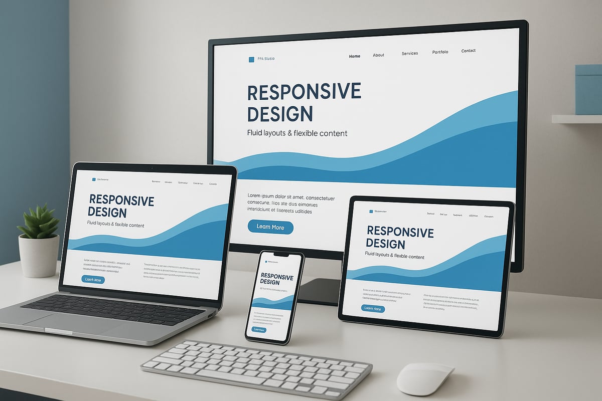
Imagine losing half your visitors because your site fails to display properly on their device. In 2026, can any business afford that risk? The digital landscape is evolving rapidly, and a responsive website is now essential for engaging users wherever they are.
This guide demystifies responsive website design, giving you actionable strategies for seamless browsing on desktops, tablets, mobiles, and new devices. You’ll learn why responsive design is crucial, the principles behind it, step-by-step processes, advanced techniques, testing methods, and what trends to watch for the future.
Why Responsive Websites Matter in 2026
Imagine opening a website on your phone, only to find it broken or unreadable. Would you stay or leave? In 2026, a responsive website is no longer optional. It is essential for attracting and retaining visitors in a digital world filled with devices of every shape and size.

The Mobile Surge and Device Diversity
Mobile and tablet usage continues to soar. According to Responsive web design statistics 2026, over 60% of global web traffic now comes from mobile devices. This shift is not limited to smartphones. Users browse on foldables, smart TVs, and even in-car displays. Expectations have changed—people want a seamless experience, whether they are scrolling on a tiny phone or browsing on a 65-inch television.
A responsive website adapts to every device, providing consistent navigation and content. If your site fails to deliver, visitors will not hesitate to move to a competitor.
| Device Type | % of Web Traffic (2026) |
|---|---|
| Smartphones | 60% |
| Tablets | 12% |
| Desktops | 22% |
| Smart TVs etc. | 6% |
SEO, Rankings, and Discoverability
Google’s mobile-first indexing means a responsive website directly impacts your search rankings. Sites that are not mobile-friendly are pushed down in results, making them harder to find. Search engines now prioritise user experience, loading speed, and accessibility signals.
If your site is not optimised for all devices, you risk losing visibility and organic traffic. This is especially critical for businesses that rely on online discovery to drive growth.
Accessibility and Inclusivity for All
A responsive website is not just about screen size. It is about making your site usable for everyone. Accessibility is now a legal and ethical necessity. People with disabilities, older users, and those using assistive technologies depend on sites that adjust for their needs.
Features such as readable font sizes, high contrast, and keyboard navigation are integral to responsive design. By focusing on inclusivity, you expand your audience and demonstrate your brand’s commitment to all users.
Business Impact and Real-World Success
The business case for a responsive website is stronger than ever. Statistics reveal that 73% of mobile users abandon sites that are not mobile-friendly. High bounce rates and lost sales are the direct results of poor design.
Conversely, a seamless experience across devices increases engagement and conversions. For example, one fashion retailer reported a 40% sales boost after relaunching with a fully responsive website. Improved user experience builds trust and strengthens brand perception. In today’s competitive market, a non-responsive site signals that your business is outdated or untrustworthy.
In summary, the responsive website is foundational to digital success in 2026. It is not a technical extra, but a vital strategy for growth, visibility, and customer satisfaction.
Core Principles of Responsive Web Design
Creating a successful responsive website hinges on a set of core principles that ensure seamless user experiences across all devices. Understanding these foundations is crucial in 2026, as device diversity and user expectations continue to grow. Let us explore the essential elements that power every effective responsive website.
Fluid Grids and Flexible Media
At the heart of every responsive website is the concept of fluid grids. Rather than relying on rigid, pixel-based layouts, designers use percentage-based widths so content naturally adapts to any screen size. This approach allows columns, images, and containers to scale in proportion, maintaining balance whether viewed on a desktop or a mobile.
Flexible images and media are equally important. By using responsive techniques like max-width: 100% in CSS, images shrink or grow as needed, preventing awkward overflows or distorted visuals. The HTML srcset and picture elements enable browsers to select the best image for the user's device and resolution, boosting both performance and appearance.
For a comprehensive dive into fluid grids and media, consider reviewing responsive web design best practices 2025, which covers up-to-date methods for building a responsive website that truly adapts.
CSS Media Queries and Breakpoints
CSS media queries are the backbone of responsive website styling. They allow developers to apply different styles based on device characteristics such as width, resolution, or orientation. This ensures your site looks and functions optimally, whether it is loaded on a smartphone, tablet, or widescreen monitor.
Breakpoints are the specific screen widths where your layout shifts to accommodate new device categories. Common breakpoints include 320px for small mobiles, 768px for tablets, 1024px for standard desktops, and 1440px for larger displays. Here is a quick reference table:
| Device Type | Common Breakpoint |
|---|---|
| Small Mobile | 320px |
| Tablet Portrait | 768px |
| Desktop | 1024px |
| Large Desktop/TV | 1440px |
By strategically setting breakpoints, you ensure your responsive website remains visually consistent and user-friendly across all platforms.
Mobile-First Approach and Touch-Friendly Navigation
Adopting a mobile-first approach means designing your responsive website for the smallest screen first, then enhancing it for larger devices. This strategy ensures essential content and features load quickly, even on slower connections. It also helps prioritise usability for the growing number of mobile users.
Touch-friendly navigation is now a necessity. Menus, buttons, and interactive elements must be easy to tap, not just click. This involves creating larger touch targets, avoiding hover-only interactions, and testing with real devices. Features like hamburger menus, sticky headers, and off-canvas panels all contribute to a smoother mobile experience.
Responsive Typography and Accessibility
Typography should scale seamlessly for a responsive website. Using relative units such as em, rem, or vw allows text to adjust for readability on any device. Modern CSS features like clamp() further enable fluid scaling between minimum and maximum sizes.
Accessibility is just as vital. High contrast ratios, adequate font sizes, and keyboard navigability ensure every user can access your content, regardless of ability or device. Always test your responsive website for screen reader compatibility and ensure interactive elements are easily reachable.
A real-world example: a local restaurant implemented breakpoints and flexible images, resulting in a site that welcomes visitors equally, whether they are browsing on a phone during lunch or on a smart TV at home.
Step-by-Step Guide: Building a Responsive Website for All Devices
Building a responsive website in 2026 is a detailed process that requires both strategic planning and technical execution. Each stage, from initial research to continuous testing, ensures your site delivers a seamless experience on every device.

Planning Your Responsive Strategy
Before writing a single line of code, understanding your audience is essential for a successful responsive website. Start by analysing device usage with analytics tools, such as Google Analytics 4. Identify if your visitors prefer mobiles, tablets, desktops, or even smart TVs. This data will guide your design priorities.
Map out user journeys across devices. For instance, a user might browse products on mobile and complete a purchase on desktop. Consider the key actions and touchpoints for each scenario.
Define the content and features that are absolutely necessary for every device. Not all elements are equally important on a small screen. Prioritise fast access to key information, such as contact details or product search.
Choose between a mobile-first or adaptive approach. Mobile-first means designing for the smallest screen and scaling up, while adaptive offers different layouts for specific devices. Your choice depends on your business goals and user base.
Wireframing is a powerful way to visualise layouts at different breakpoints. For example, sketch an e-commerce homepage for desktop, tablet, and mobile, focusing on product grids, navigation, and banners.
Set clear performance and accessibility goals from the outset. Fast load times and compliance with accessibility standards like WCAG 2.2 should be non-negotiable.
A well-planned strategy lays the foundation for a responsive website that truly serves every user.
Designing Flexible Layouts and Navigation
A responsive website needs layouts that adapt fluidly to all screen sizes. CSS Grid and Flexbox are the industry standards for creating structures that reflow as needed. For example, a portfolio site might display four columns on desktop, two on tablet, and a single column on mobile, all managed with a few lines of CSS.
Navigation is equally critical. Menus must be accessible by both touch and mouse users. Consider sticky headers for easy access, hamburger menus to save space, and off-canvas panels for secondary options.
When designing navigation, ensure it scales gracefully. Buttons and links should be large enough for fingers, not just cursors. Avoid hiding important content or creating “mobile-only” sections that break consistency.
Maintaining visual consistency is vital. Use a unified colour palette, consistent typography, and clear branding across all devices. This helps users recognise your brand wherever they access your site.
Content hierarchy should adapt smoothly as the layout changes. Headlines, calls to action, and primary images must remain prominent, regardless of screen size.
A flexible approach to layouts and navigation is the backbone of any responsive website. It ensures users can find what they need, no matter their device.
Implementing Responsive Images, Media, and Typography
Images and media can make or break a responsive website. Using srcset and picture elements allows browsers to select the appropriate image size for each device, reducing load times and saving data. For example, serve high-resolution images to desktops and smaller, optimised versions to mobiles.
Optimise all images for fast loading by compressing files and using modern formats like WebP. Responsive SVGs are ideal for icons and graphics, as they scale perfectly on any screen.
Videos should be embedded responsively, using aspect ratio containers to prevent layout breaks. Enable lazy loading so media only loads when needed, further improving performance.
Typography must also adapt. Use CSS functions like clamp() and viewport units (vw) to create text that scales smoothly. This keeps your content readable on everything from tiny phones to large monitors.
A blog might switch from landscape images on desktop to square images on mobile for better fit. Always check that media does not overflow or disrupt your layout.
By handling images, media, and fonts responsively, your website will look polished and load quickly across all platforms.
Coding with Modern Responsive Frameworks and Tools
Choosing the right tools can accelerate your responsive website development. Popular frameworks such as Bootstrap 5, Tailwind CSS, and Foundation offer pre-built grids, components, and utility classes. These frameworks help you maintain consistency and save time, especially for large projects.
However, frameworks are not always the best fit. Sometimes, custom CSS provides more control and smaller file sizes, which can lead to faster load times. Evaluate your project’s complexity and team expertise before deciding.
Using design tools like Figma allows you to prototype responsive layouts and test interactions before coding. Build tools, such as Webpack or Vite, help optimise assets, minify CSS, and improve performance.
Staying current with framework updates is crucial. The landscape evolves rapidly, so check release notes and community forums regularly.
If you are seeking professional support, web design services in Leicester can help you implement advanced frameworks and ensure your responsive website meets local business needs.
By leveraging the right mix of frameworks, tools, and expertise, you can deliver a responsive website that is efficient and future-proof.
Testing, Debugging, and Iterating Responsively
Testing is an ongoing process for any responsive website. Use real devices and emulators, like Chrome DevTools and BrowserStack, to preview your site across a wide range of screen sizes.
Accessibility checkers and Lighthouse audits highlight areas for improvement, including font sizes, touch targets, and colour contrast. Addressing these ensures a positive experience for all users.
Common responsive bugs include content overflow, misaligned elements, and touch targets that are too small. Regularly review analytics to identify where users encounter issues.
Gather feedback directly from users and team members. Iterative improvement is key. Fix navigation bugs that only appear on specific devices, such as the iPhone SE, and document these solutions for future reference.
A responsive website is never truly finished. Continuous testing and refinement keep your site performing at its best as new devices and standards emerge.
Advanced Responsive Techniques for 2026 and Beyond
The digital landscape is evolving at a rapid pace, and a responsive website must keep up with emerging technologies and user expectations. In 2026, advanced techniques are critical for delivering seamless experiences across every device and context.

Embracing New Device Categories
Responsive website strategies now extend far beyond traditional screens. Foldable smartphones, wearables, smart TVs, and AR/VR headsets are becoming mainstream, each presenting unique interface challenges.
To meet user expectations, designers must ensure layouts adapt to unusual aspect ratios and resolutions. For instance, foldable devices may shift from a compact phone view to a tablet-sized display in one motion. Smart TVs require intuitive navigation at a distance, while wearables demand concise, glanceable content.
Staying updated with device trends is essential. According to Web design statistics 2026, the number of connected devices per user continues to grow, intensifying the need for a responsive website that maintains consistency everywhere.
The Power of Container Queries
Traditional CSS media queries rely on viewport size, but with the rise of complex layouts and component-driven design, container queries are revolutionising the responsive website approach.
Container queries allow elements to adapt based on the size of their parent container, not just the browser window. This results in more modular, reusable components that respond intelligently within flexible grids.
Consider a travel booking site with dynamic widgets. Using container queries, each widget can scale, reflow, or change appearance based on its allocated space, rather than the overall screen. This technique supports intricate layouts and micro-frontends, ensuring every part of a responsive website looks and functions optimally.
Responsive Animations and Micro-Interactions
Modern users expect interfaces that feel alive and intuitive. Advanced responsive website design now includes fluid animations and micro-interactions that adapt to device capabilities and user context.
Animations must scale smoothly, avoiding performance issues on lower-powered devices. CSS properties like prefers-reduced-motion respect users' accessibility preferences, ensuring inclusivity. Micro-interactions, such as button feedback or swipe gestures, enhance usability and delight users.
For example, a responsive website for a fashion brand might use subtle hover effects on desktop, while translating these to tap animations on mobile. Animation libraries and CSS transitions can be tailored for responsiveness, creating a cohesive experience across all platforms.
Future-Proofing with Advanced Tools and Trends
Looking ahead, several innovations will shape the responsive website landscape. Progressive Web Apps (PWAs) bridge the gap between web and native apps, offering offline access and push notifications. Variable fonts and fluid typography allow branding to remain consistent yet flexible, adapting to any screen.
Dark mode and user-preference media queries give users control over visual comfort. Performance optimisation, such as lazy loading and code splitting, keeps sites fast regardless of device or connection. Keeping pace with standards like CSS Houdini and new viewport units will help developers maintain a competitive edge.
A real-world example is a travel site deploying container queries for interactive booking widgets, ensuring each module adjusts perfectly on foldables, tablets, and desktops. By embracing these advanced techniques, a responsive website remains robust, engaging, and ready for whatever the future holds.
Measuring Responsive Website Performance and User Experience
Understanding how your responsive website performs is crucial for sustained digital success. If your site loads slowly or frustrates users, they will quickly look elsewhere. Measuring both performance and user experience helps you spot issues and optimise for every device your audience uses.
Key Performance Metrics for a Responsive Website
To gauge the effectiveness of your responsive website, focus on the following metrics:
- Bounce Rate: Measures the percentage of visitors who leave after viewing only one page. A high bounce rate can indicate poor mobile usability.
- Session Duration: Reveals how long users stay engaged. Longer sessions usually reflect a better experience.
- Conversion Rate: Tracks how many visitors complete desired actions, such as purchases or sign-ups.
- Core Web Vitals: Google's benchmarks for load speed, interactivity, and visual stability. These are essential for ranking and user satisfaction.
Regularly reviewing these metrics allows you to identify where your responsive website excels and where improvement is needed.
Essential Tools for Performance and UX Tracking
You need the right tools to measure and refine your responsive website. Leading solutions include:
- Google Analytics 4: Detailed insights into user behaviour across devices.
- Search Console: Tracks search visibility and mobile usability issues.
- Performance Monitoring Platforms: Services like Lighthouse and PageSpeed Insights highlight speed and Core Web Vitals.
- Heatmaps and User Recordings: Tools such as Hotjar or Microsoft Clarity let you see exactly how users interact with your site in real scenarios.
For more advice on optimising site speed and performance, see website speed and performance tips.
Analysing Real User Behaviour and Accessibility
Go beyond numbers by watching real users interact with your responsive website. Heatmaps reveal where visitors click, scroll, or get stuck, while session recordings show the user journey, especially on mobile.
Accessibility audits are vital. Use tools to check for WCAG 2.2 compliance, ensuring your site works for everyone, including users with disabilities. This is a legal and ethical responsibility for any modern responsive website.
A/B testing different layouts for mobile and desktop can highlight what works best, helping you optimise conversions. For practical strategies on improving user experience, explore user-friendly design best practices.
Continuous Improvement and Real-World Impact
Responsive website performance is not a one-time task. Set up feedback loops by collecting user feedback and monitoring analytics regularly. Small changes, like refining a mobile checkout process, can have a big impact. For instance, an e-commerce retailer improved sales by 30% after optimising their mobile experience.
Ongoing measurement ensures your responsive website remains competitive, accessible, and ready for the evolving digital landscape.
The Future of Responsive Web Design: Trends to Watch in 2026
The responsive website landscape is transforming at an unprecedented pace. As we look to 2026, the industry is shaped by emerging technologies and shifting user expectations. According to the Responsive web design services market report, demand for flexible, future-proof solutions is soaring as businesses recognise the value of reaching users on every device.
AI-Powered Design and Automation
Artificial intelligence is revolutionising the responsive website workflow. AI-driven tools now automate layout decisions, adapt content in real time, and predict user needs based on device and context. Designers can rapidly prototype variations, while machine learning analyses visitor behaviour to optimise experiences.
These advancements mean creating a responsive website is no longer a manual, one-size-fits-all process. Instead, sites can adjust images, navigation, and even calls to action dynamically, ensuring every user gets a tailored interaction.
Voice Search, Conversational UI, and Personalisation
Voice search is becoming integral to the responsive website experience, especially on mobile and smart devices. Integrating conversational UI allows users to interact hands-free, making navigation seamless across contexts.
Personalisation is also taking centre stage. Responsive website content now shifts based on device, user location, and past behaviour. AI-powered personalisation engines serve different layouts, product grids, or offers to maximise relevance and engagement.
Headless CMS, No-Code, and Cross-Channel Experiences
Headless CMS and API-driven architectures are enabling more flexible responsive website builds. Content can be delivered quickly to websites, apps, kiosks, and IoT devices, all from a single source. This approach supports the demand for consistent brand experiences everywhere.
No-code and low-code platforms are lowering the barrier to entry for building a responsive website. Businesses can launch and update sites faster, focusing on user experience rather than technical complexity. Cross-channel integration ensures users can switch between devices and platforms with no friction.
Sustainability, New Standards, and Continuous Innovation
With growing concerns over digital sustainability, designers are optimising responsive website performance for lower energy use and faster load times. Techniques like code splitting, lazy loading, and prioritising critical CSS are now standard practice.
New CSS standards, such as container queries and advanced viewport units, are making responsive website layouts even more adaptable. Accessibility guidelines are evolving, ensuring every user can benefit from these advances.
Consider this example: retailers are using AI to automatically optimise product grids for each device, boosting conversion rates and reducing bounce. The future of any responsive website will depend on continuous learning and agility, as trends and technologies evolve rapidly.
Key Trends Table
| Trend | Description |
|---|---|
| AI-powered design | Automated layouts, content adaptation, and predictive UX |
| Voice UI | Voice search and conversational interfaces for hands-free interaction |
| Personalisation | Dynamic content and layouts based on user/device/context |
| Headless CMS | API-first architectures for multi-channel delivery |
| No-code builders | Simplified, rapid site creation and updates |
| Sustainability | Efficient coding and faster, greener websites |
| New CSS standards | Container queries, viewport units, and enhanced accessibility |
Staying ahead in the responsive website game means embracing these trends, investing in new skills, and adopting a mindset of continuous improvement.
Now that you understand what it takes to create a truly responsive website for 2026 and beyond, you might be wondering how to put these strategies into action for your own business. At Ruff Idea, we specialise in crafting bespoke, user friendly websites that look outstanding on any device—from mobiles to emerging tech like smart TVs and foldables. If you want an online presence that’s not just visually impressive but also optimised for SEO and conversions, we’re here to help. Let’s chat about how we can future proof your site together.
Get in touch


